Tiksom

About Tiksom
Primary color palette is: green, orange, dark grey, and light grey.
Color Palate & Typography


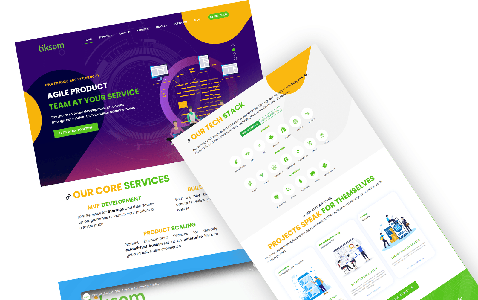
Website Design
Problem Statement

Project Summary
Old website has too much information, graphics, and text. Making it difficult to focus on what is important.
- Website design was outdated and not aesthetically pleasing.
- The website didn't reflect the company's brand values.
- The website wasn't optimized for mobile devices
- Website content wasn't engaging & informative.
Responsive Design: The website should be optimized for mobile and tablet devices, as more and more people are accessing the internet on these devices.
Emphasis on Services: Tiksom’s services should be prominently displayed on the website, with detailed information on what they offer and how they can help businesses.
Testimonials and Case Studies: Testimonials from satisfied clients and case studies of successful projects can help build trust and demonstrate tiksom’s expertise.
The Outcome
Overall, a website redesign that focuses on user experience, clear messaging, and showcasing Tiksom’s services and strengths which helped company attract and retain more clients.
We provided:
- SEO optimized code.
- HTML 5 compliant code.
- Animated full-width slider.
- Modern & clean website design.

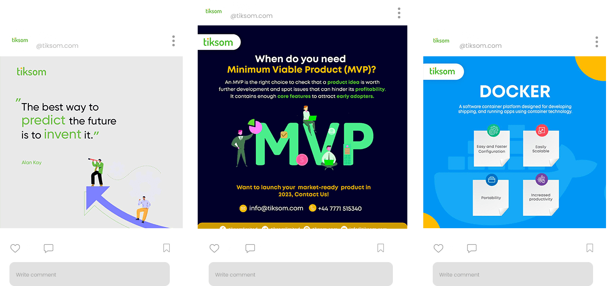
Social Media Design

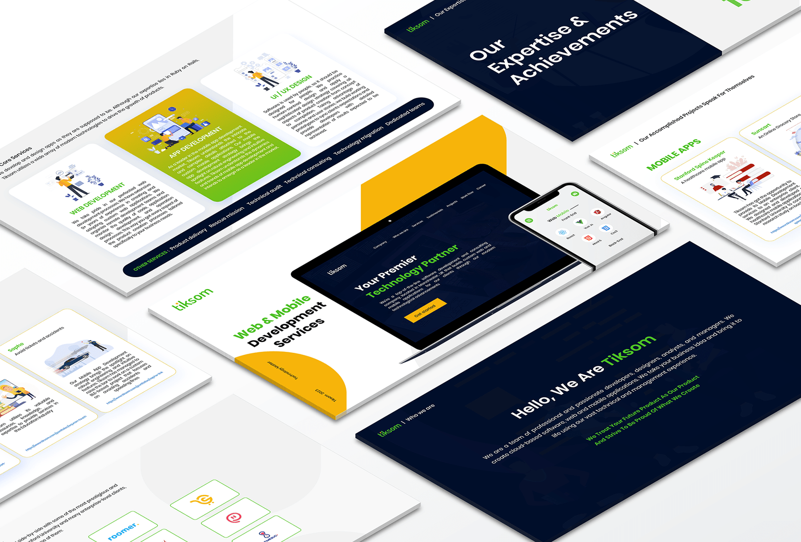
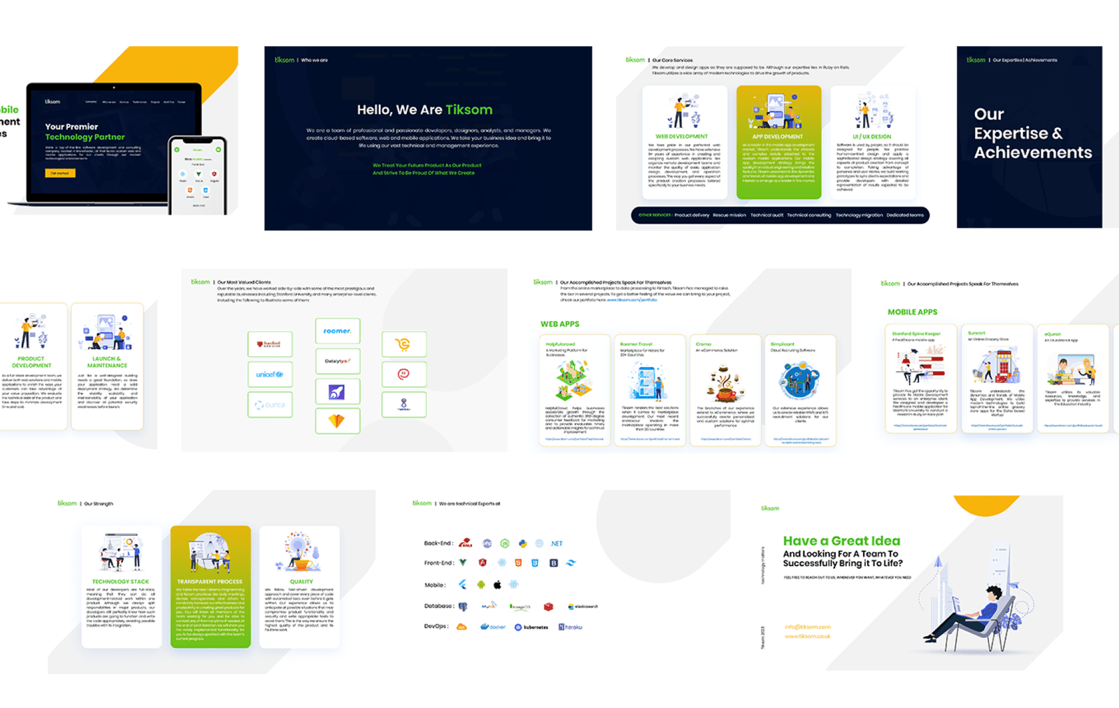
Presentation Design
